4 minutes
30 Day Map Challenge
Topi Tjukanov started the challenge in 2019 on Twitter.
The idea is to create maps based around different themes each day of November using the hashtag #30DayMapChallenge. You can prepare the maps beforehand, but the main idea is to publish maps on the dedicated days. Just include a picture of the map when you post to Twitter (or other platforms) with the hashtag. You don’t have to sign up anywhere to participate. There are no restrictions on the tools, technologies or the data you use in your maps. Doing less than 30 is also fine.
Theme Calendar🗺 ☝️
This post will archive my personal progress.
Day 1: Points
Street tree data from the TreesCount! 2015 Street Tree Census, conducted by volunteers and staff organized by NYC Parks & Recreation and partner organizations. Tree data collected includes tree species, diameter and perception of health.
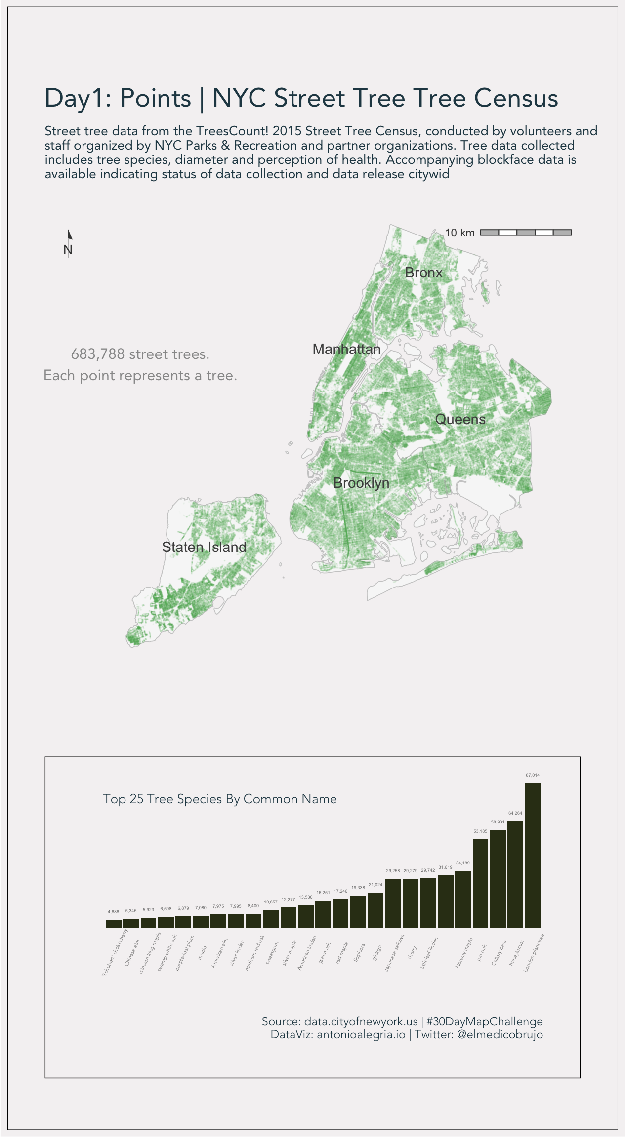
🌳
Day 2: Lines
The Nazca Lines are a group of geoglyphs made in the soil of the Nazca Desert in southern Perú. They were created between 500 BCE and 500 CE by people making depressions or shallow incisions in the desert floor, removing pebbles and leaving differently colored dirt exposed. There are two major phases of the Nazca lines, Paracas phase, from 400 to 200 BCE, and Nazca phase, from 200 BCE to 500 CE. In the years leading up to 2020, between 80 and 100 new figures had been found with the use of drones, and archaeologists believe that there are more to be found.
SHP data came from: www.geogpsperu.com
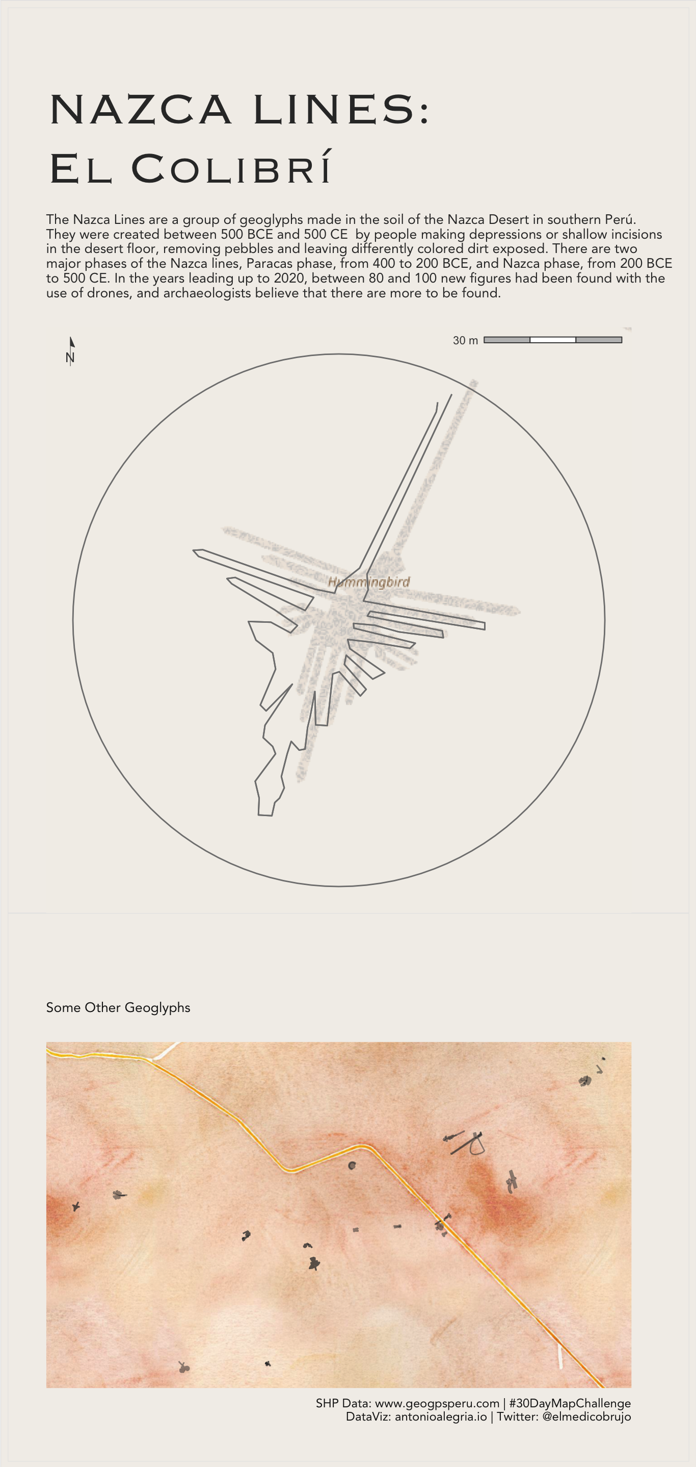
🇵🇪
Other Nazca lines:
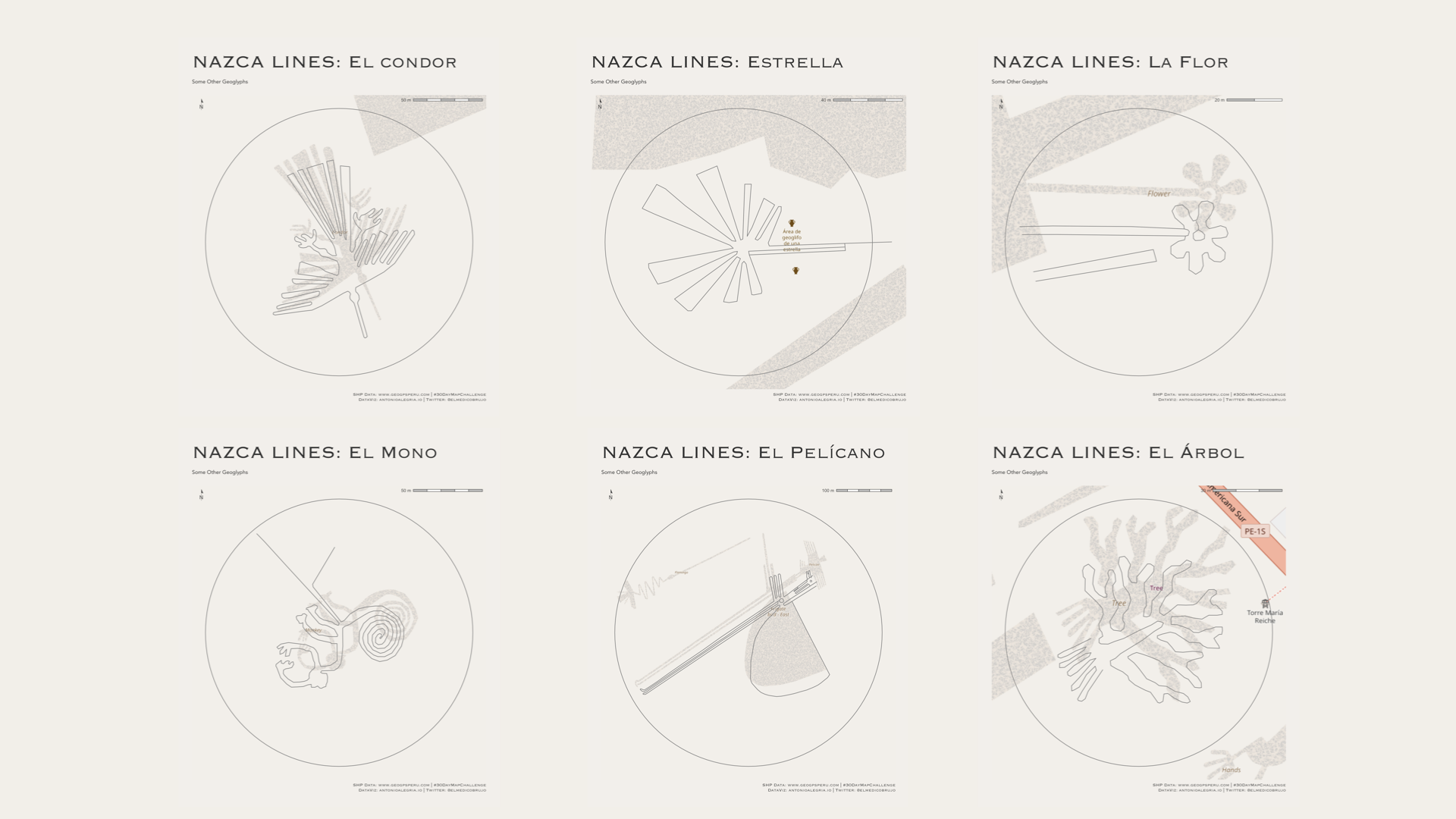
🇵🇪
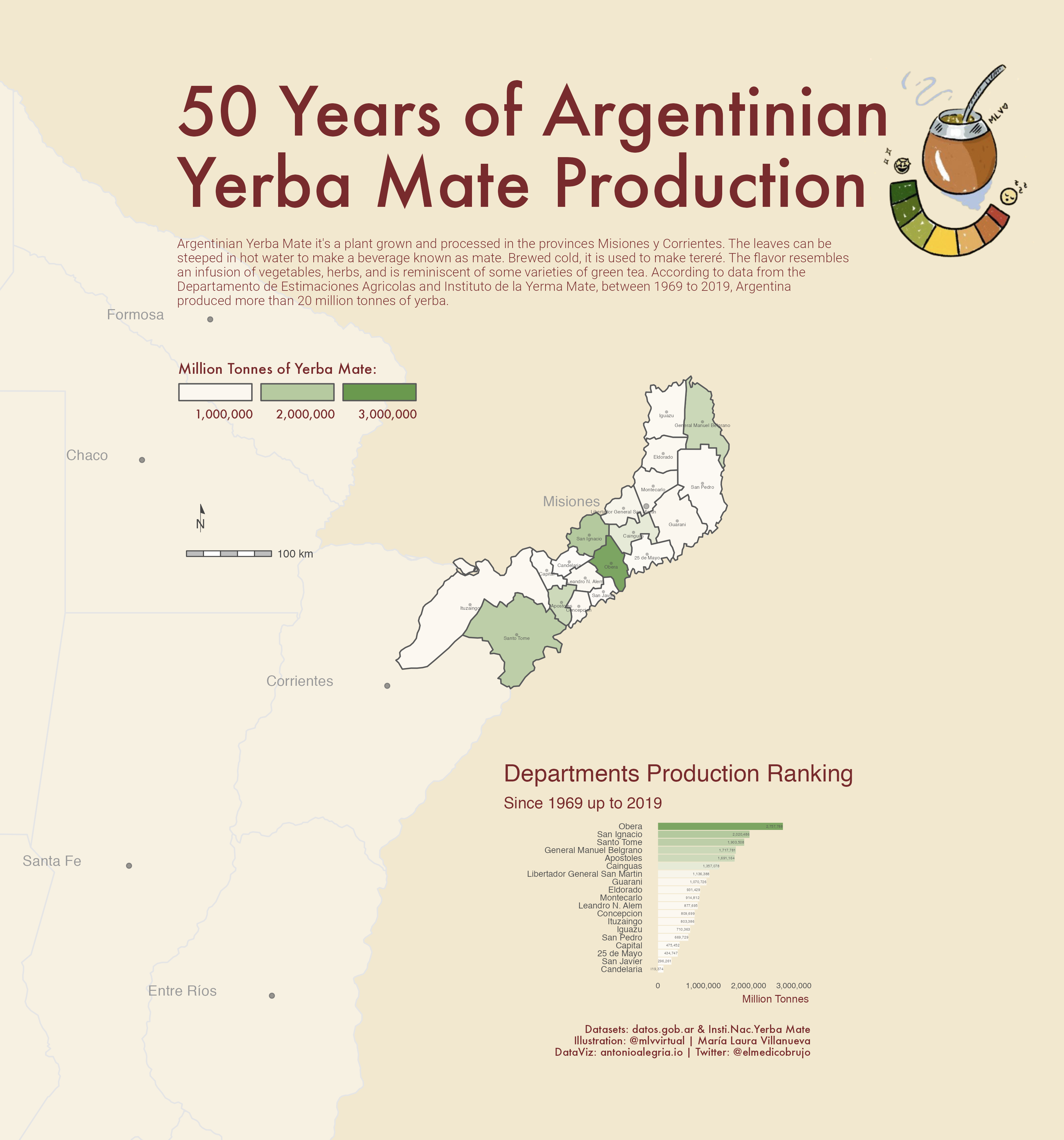
Day 4: Green
Argentinian Yerba Mate it’s a plant grown and processed in the provinces Misiones y Corrientes. The leaves can be steeped in hot water to make a beverage known as mate. Brewed cold, it is used to make tereré. The flavor resembles an infusion of vegetables, herbs, and is reminiscent of some varieties of green tea. According to data from the Departamento de Estimaciones Agricolas and Instituto de la Yerma Mate, between 1969 to 2019, Argentina produced more than 20 million tonnes of yerba.
Datsets: Departamento de Estimacones Agricolas y del Instituto Nacional de la Yerba Mate
Geometries: Portal de datos abiertos de Argentina
Matecito Illustration: María Laura Villanueva (MLV)
🧉
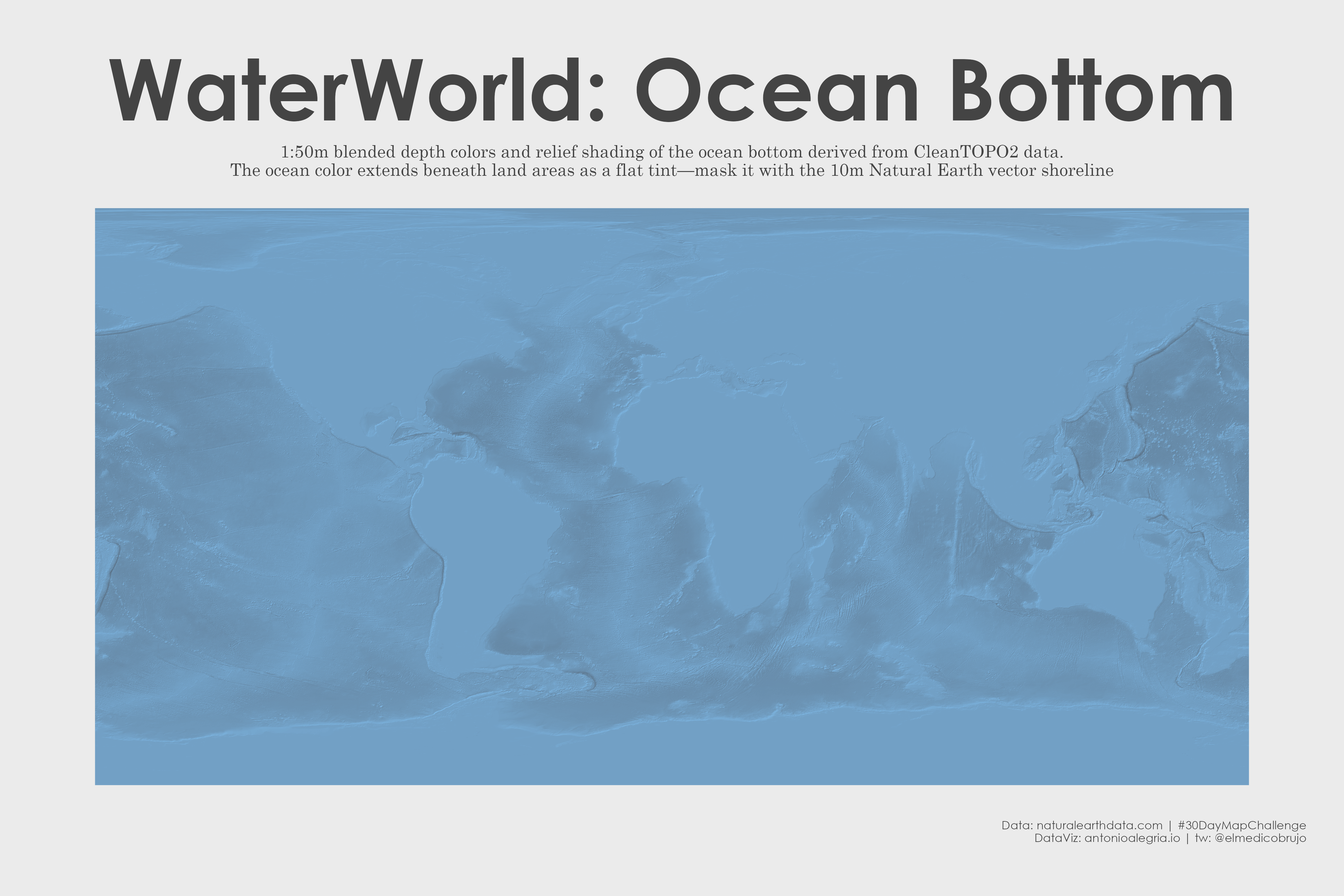
Day 7: Raster
1:10m Ocean Bottom
Blended depth colors and relief shading of the ocean bottom derived from CleanTOPO2 data. The ocean color extends beneath land areas as a flat tint—mask it with the 10m Natural Earth vector shoreline, or a shoreline from another data source.
Raster: naturalearthdata.com
🌊
Day 10: Bad Map
A USA Choropleth map with alpha value below 0.01
Data US Census Bureau
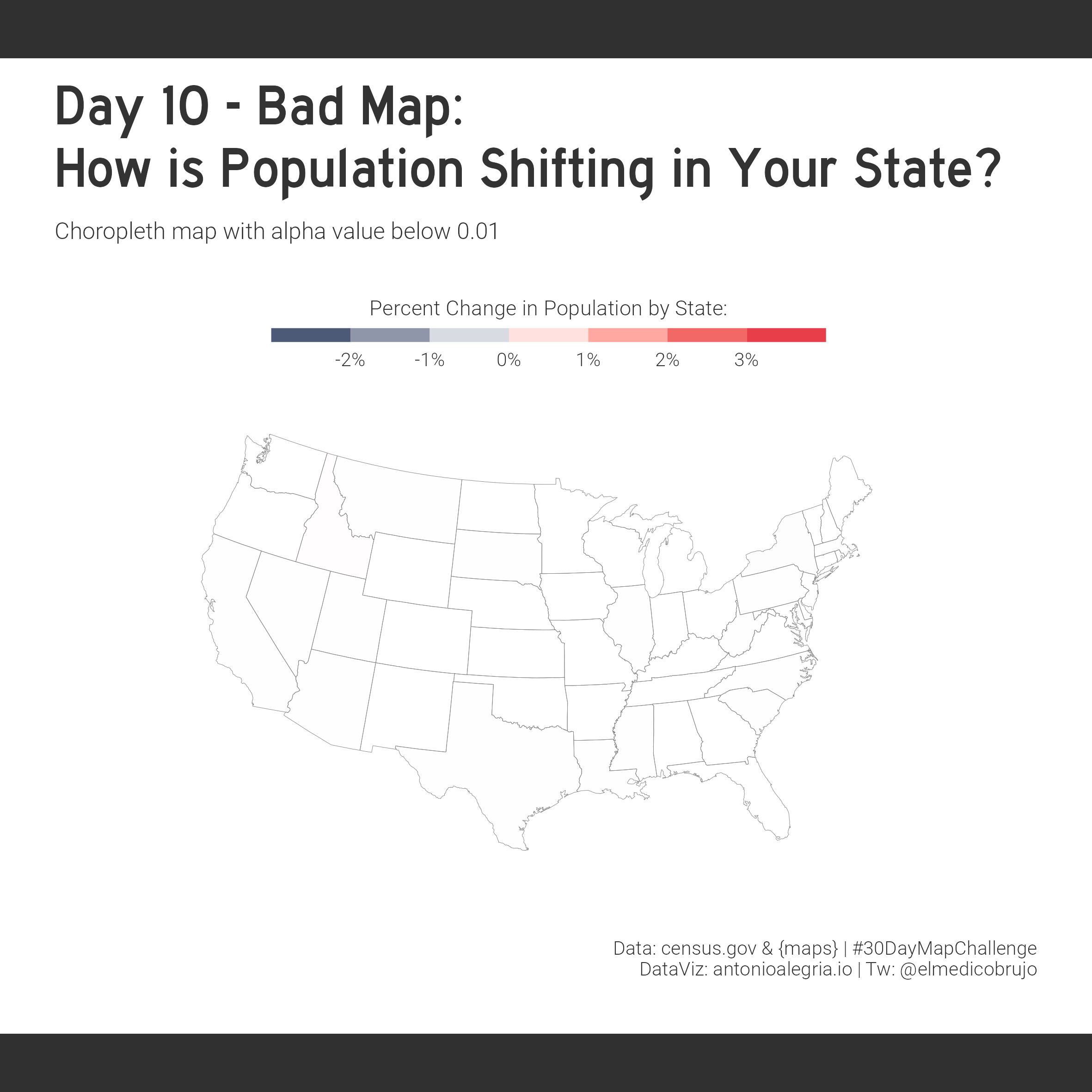
If you squint hard enough, it might look good
The real post -> American Migration During Covid19
Day 16: Minimal
Unrealized DC Metro map designs. Although Massimo Vignelli, while at Unimark International, designed the signage for the Washington DC Metro subway in 1968, he didn’t design the map (which was designed by Lance Wyman).
Data Open Data DC
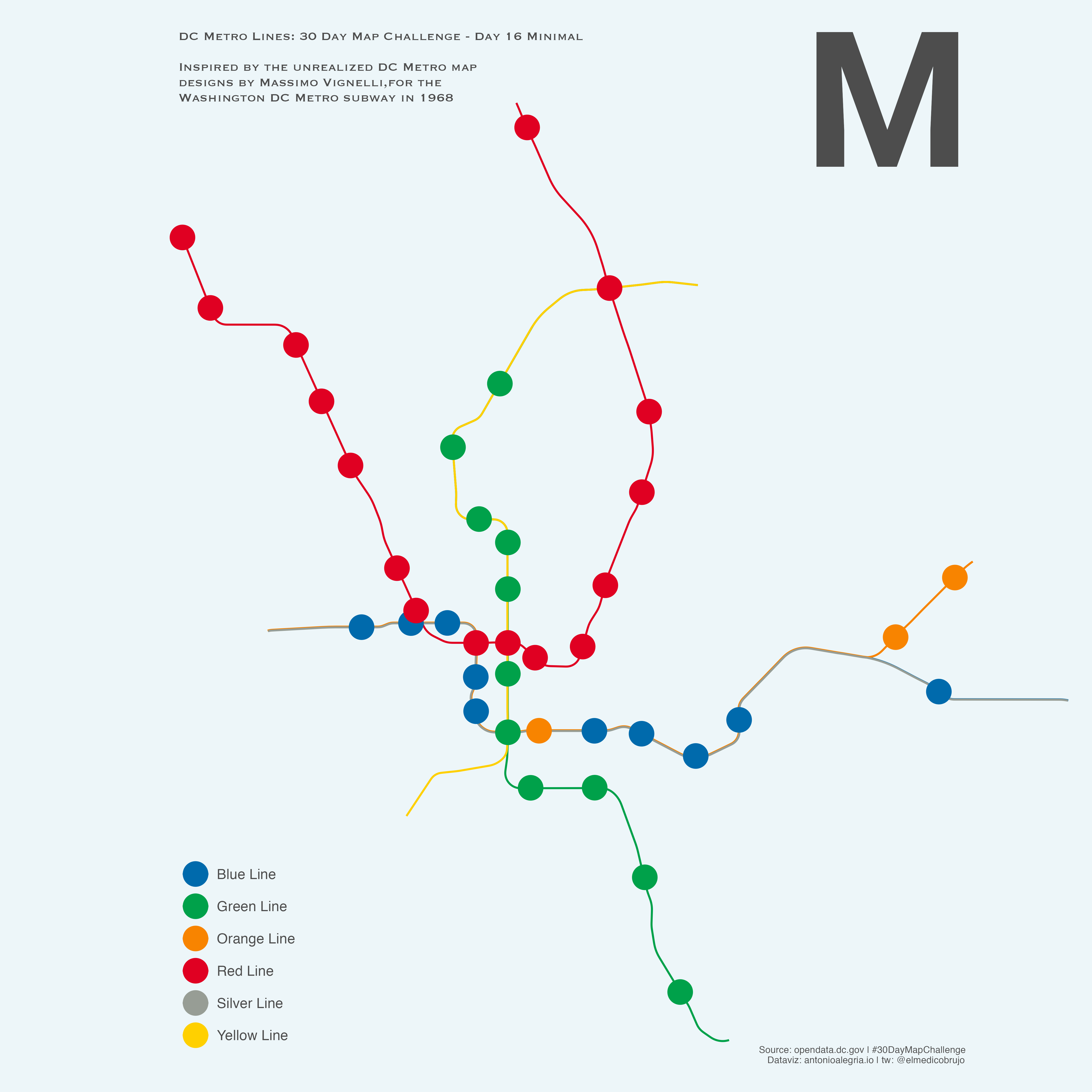
Ⓜ️🚇
You can check the original designs here -> Vignelli Center
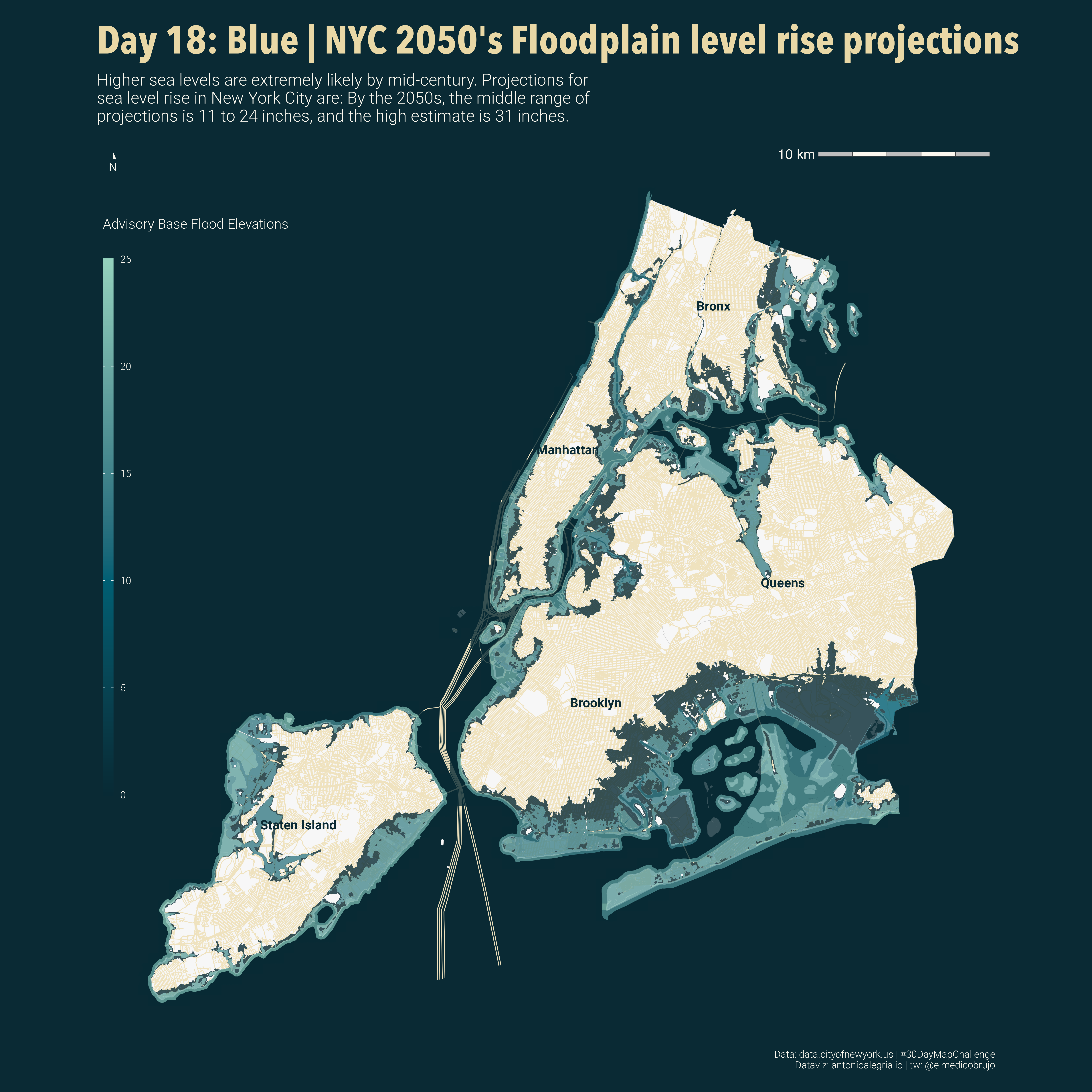
Day 18: Blue
Maps that show future coastal flood risk (including areas affected by coastal storm surges combined with sea level rise)
Data NYC Open Data
🌊🐟
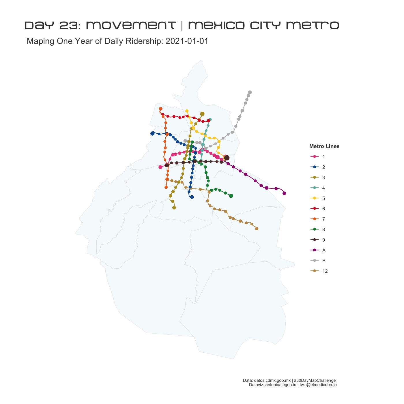
Day 23: Movement
Map with daily ridership from each station of Mexico City metro system.
Data Portal de datos abiertos de la CDMX
Ⓜ️🚆
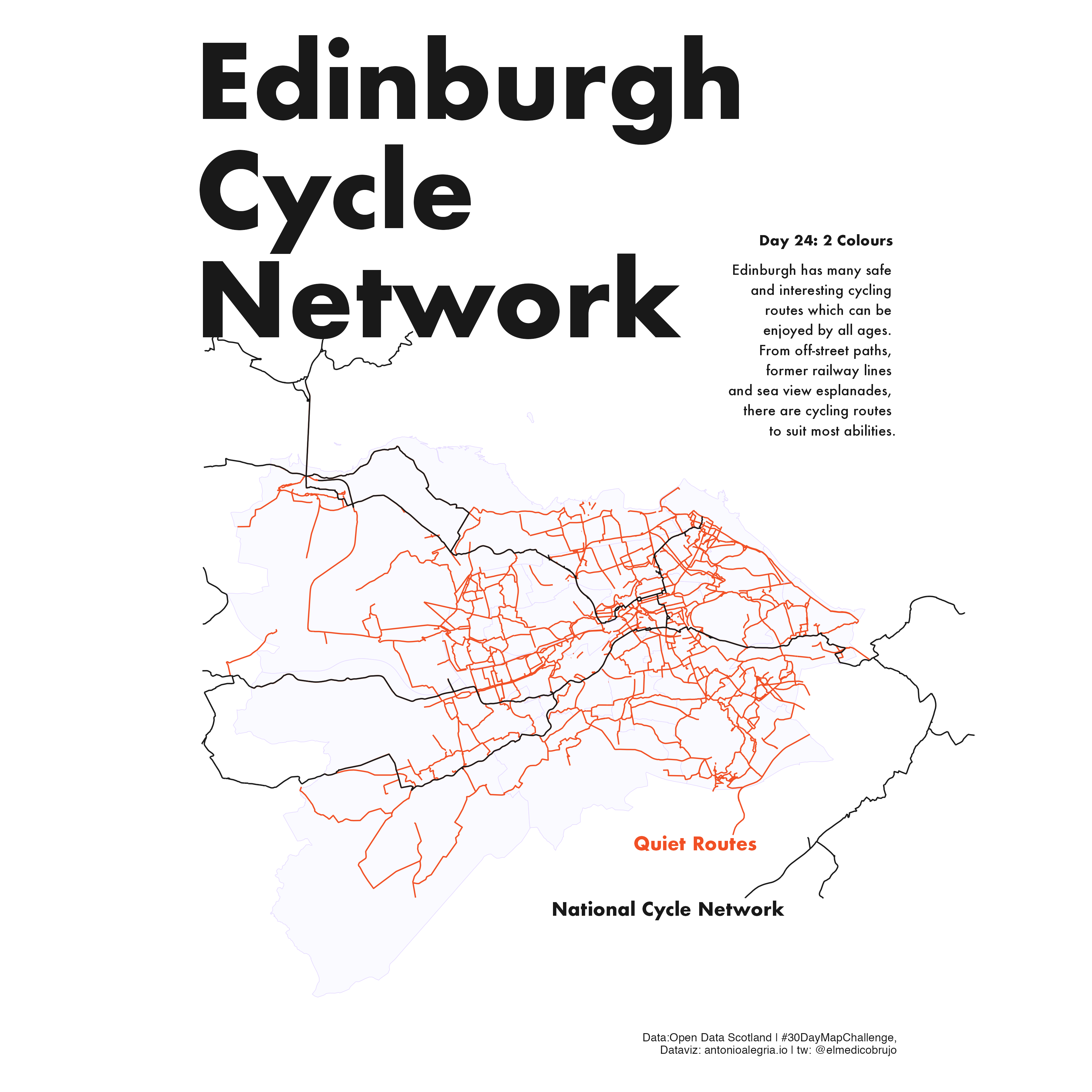
Day 25: 2 Colours
National cycle network routes and quiet routes for local walking or cycling within the Edinburgh Council area.
Data: National Network + Quiet routes
🏴 🚲
Day 29: Out
… of my comfort zone
Barcelona elevation map with rayshader.
Data:
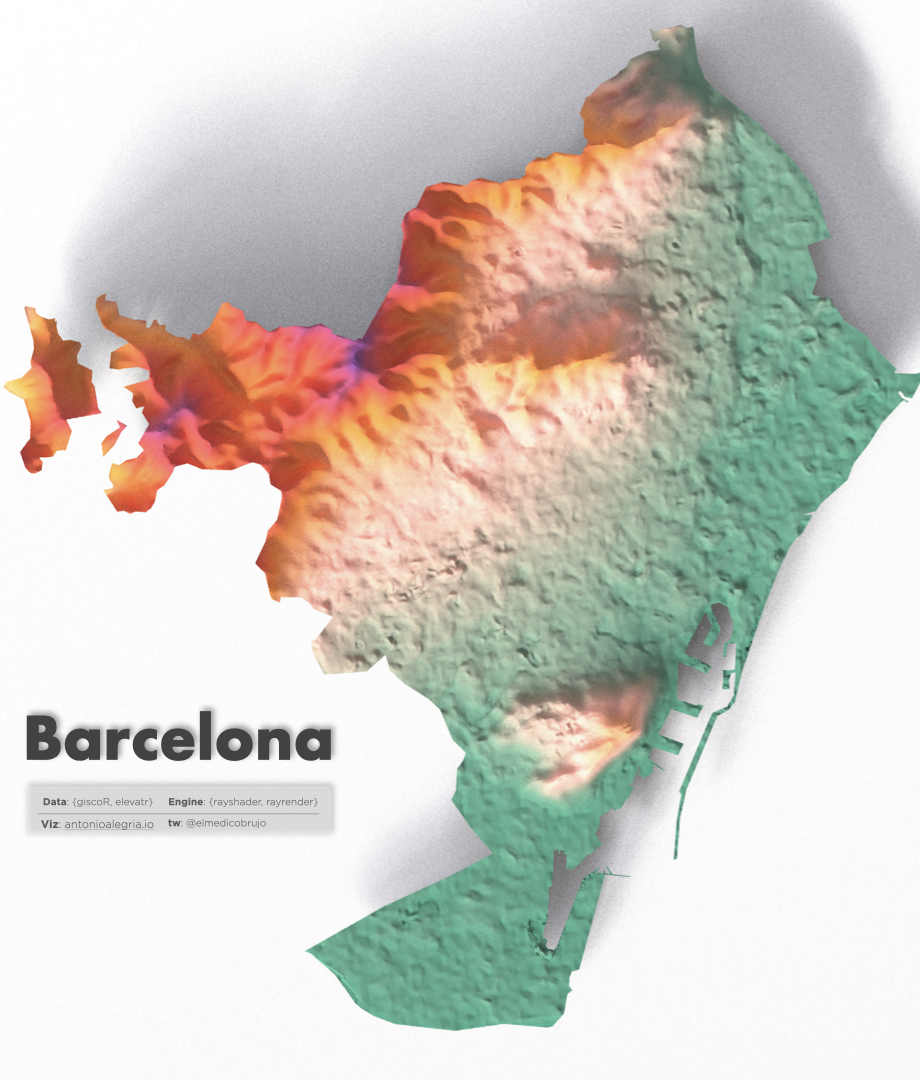
🗺🏔💻
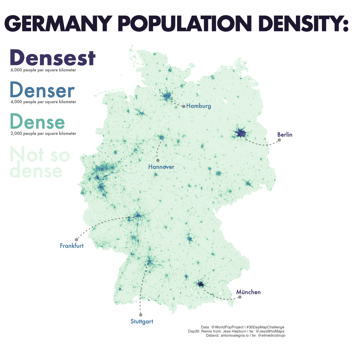
Day 30: Remix
Last Day!
Estimated population density per grid-cell.The units are number of people per square kilometer.
Data:
Remix is based on How wet is it really? from JessWhoMaps
🇩🇪👥
..See you next year.